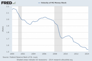
Most people that discuss the “economic collapse” focus on what is coming in the future. And without a doubt, we are on the verge of some incredibly hard times. But what often gets neglected is the immense permanent damage that has been done to the U.S. economy by the long-term economic collapse that we are already experiencing. In this article I am going to share with you 12 economic charts that show that we are in much, much worse shape than we were five or ten years ago. The long-term problems that are eating away at the foundations of our economy like cancer have not been fixed. In fact, many of them continue to get even worse year after year. But because unprecedented levels of government debt and reckless money printing by the Federal Reserve have bought us a very short window of relative stability, most Americans don’t seem too concerned about our long-term problems. They seem to have faith that our “leaders” will be able to find a way to muddle through whatever challenges are ahead. Hopefully this article will be a wake up call. The last major wave of the economic collapse did a colossal amount of damage to our economic foundations, and now the next major wave of the economic collapse is rapidly approaching.
 http://theeconomiccollapseblog.com/archives/12-charts-that-show-the-permanent-damage-that-has-been-done-to-the-u-s-economy
